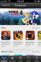
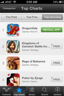
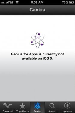
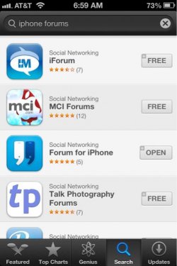
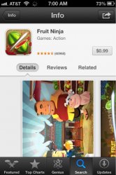
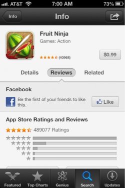
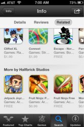
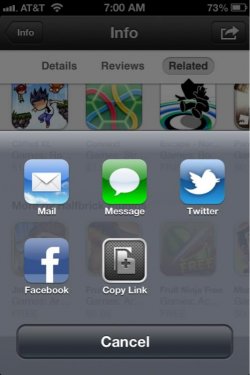
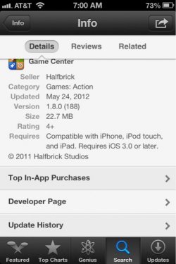
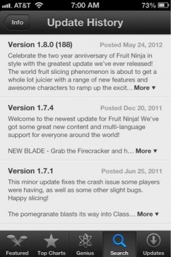
With the iOS 6 update, Apple has completely redesigned the look of the App Store. iOS 6 has a bit of a retro grey theme which was implemented into most of the applications. Buttons are bigger, the UI looks smoother and page layouts are much different. At the top of the Featured page you will see one large banner instead of 4 mediums ones. This banner scrolls automatically or can be swiped for quicker viewing of featured apps. Each category such as What's Hot or New are all on one page and can be scrolled through or you can press the "See All" button. This layout/UI can be seen throughout the whole App Store now and in my opinion looks wonderful.
Last edited by a moderator:

